In our previous discussion we had talked about the origins of risk-o-meter and how the rejigged methodology makes the risk-o-meter a standardised and relevant measure to compare funds in terms of risk. In this article we will focus on how useful the revamped risk-o-meter is in calling out the funds which assume greater risk than their peers. So, let's dive deep into actual numbers for equity and debt funds to find some answers.
Equity funds
To put it shortly, the new risk-o-meter for equity funds has disappointed. It fails to make any distinction between funds ranging from aggressive hybrids to passive large-cap index funds to small-cap funds or even sector funds. Virtually all funds in every equity category have got the 'Very High' risk tagging (see the chart 'Equity funds as placed on the risk-o-meter'). These results are obviously far from satisfactory. The level of risk inherent in a small-cap fund versus an aggressive hybrid, which invests partly in debt, is clearly very different. But the risk-o-meter fails to acknowledge that.
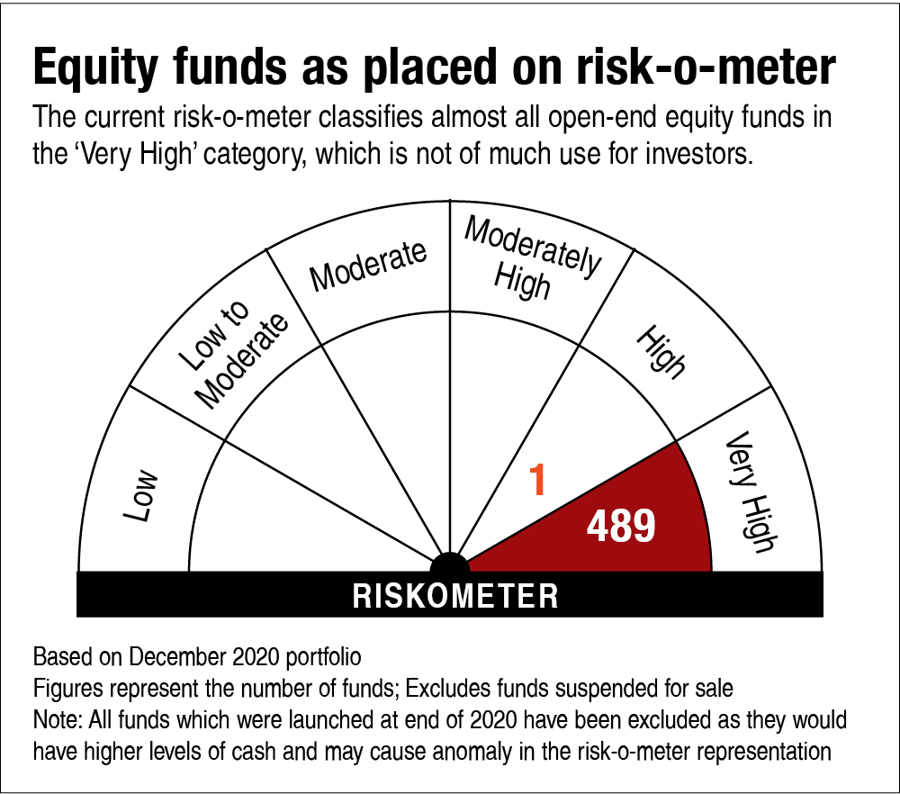
While we still believe that there is nothing wrong with the underlying parameters chosen to define the risk, it is the way the risk values are assigned and then combined into an aggregate risk grade that needs a tweak. With the current rules, it appears to have become a mathematical improbability for any equity fund to have a risk level other than 'High Risk' or 'Very High Risk'. So, investors will have to wait for the next version before putting the risk-o-meter to some good use.
So, there you go. All the hype we had built up about the risk-o-meter in our previous discussion has come down to a nought. But wait. There's more to this story.
Debt funds
On the debt side, the risk-o-meter passes with flying colours. And this is where it holds a lot more relevance too. Debt-fund investors have witnessed frequent and massive NAV markdowns since the IL&FS fiasco in late 2018, followed by segregations due to industry-wide defaults and the winding-up of six yield-oriented schemes. So, the risks in debt funds have come about in a substantial way in the recent times.
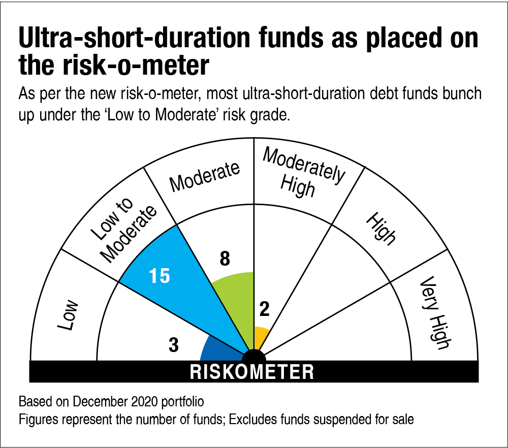
The new risk-o-meter disclosures are very informative. For instance, let's look at the seemingly homogeneous and fairly narrowly defined category of ultra-short-duration funds (the chart titled 'Ultra-short-duration funds as placed on the risk-o-meter'). Here, the funds spread across four risk grades.
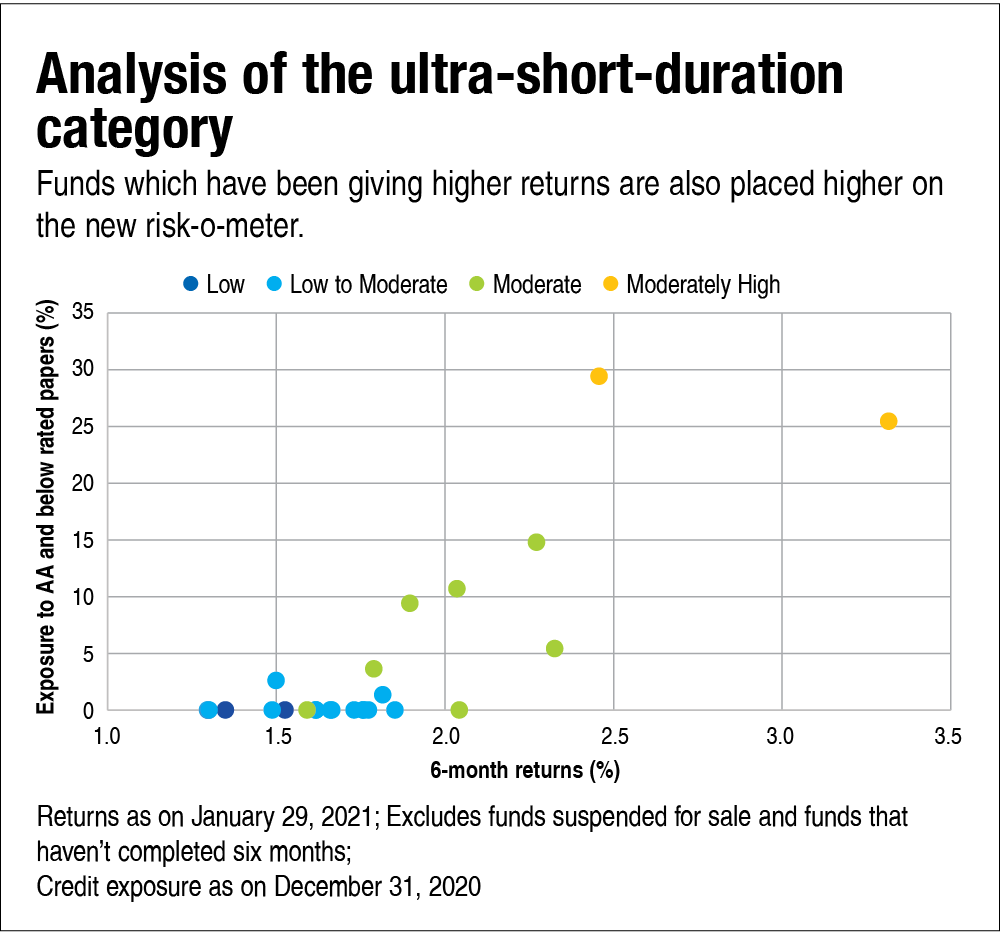
A further analysis reveals some important implications for investors. Look at the graph titled 'Analysis of the ultra-short-duration category', where we have mapped the funds' risk grades alongside their returns and exposures to lower-rated papers. The data speaks for itself. Funds that have delivered higher returns are also riskier on credit quality, and the risk-o-meter has been able to pick those risk signals loud and clear. Even though most funds bunch up under the 'Low to Moderate' tag, it has been effective in calling out the outliers.
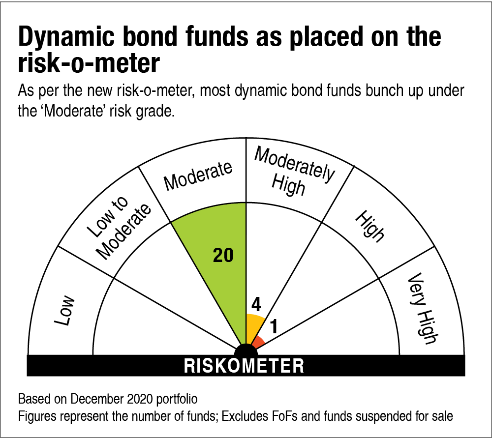
Now let's look at the risk-o-meters in the dynamic bond fund category. This versatile category spans across three risk-o-meter tags (look at the graph 'Dynamic bond funds as placed on the risk-o-meter') but most bunch up under 'Moderate'.
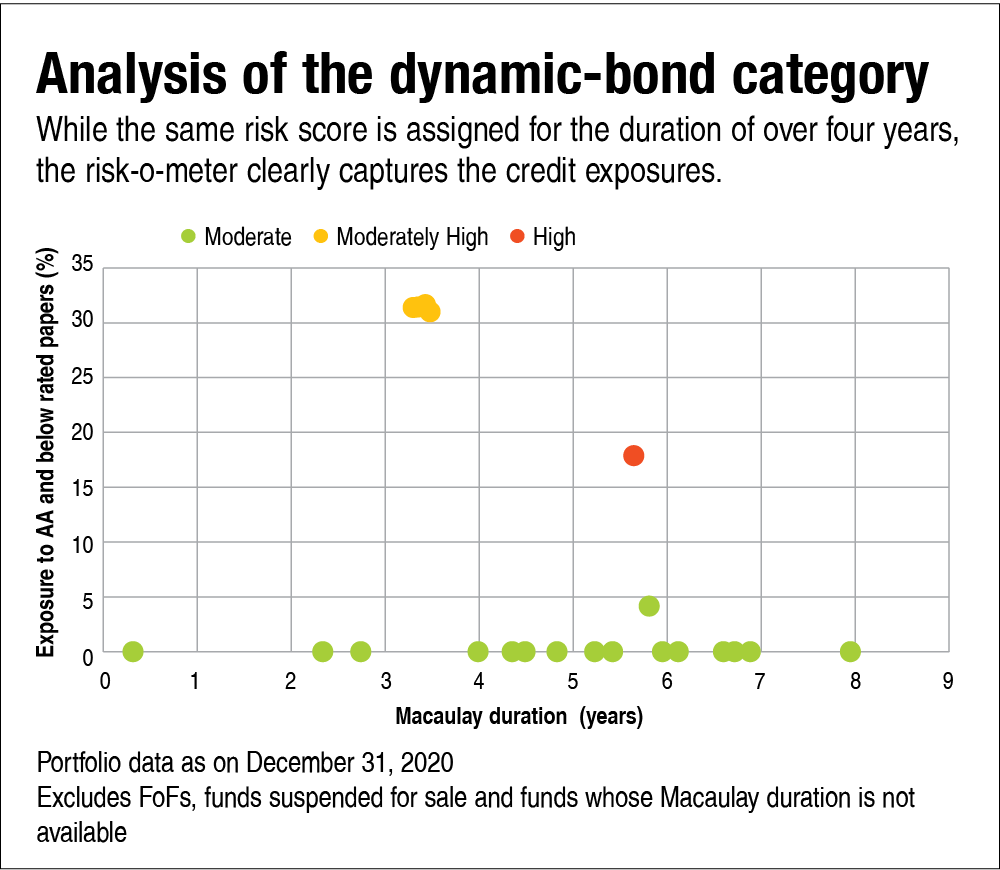
Most funds in this category currently have a Macaulay duration of over four years. Now, according to the methodology, while the same risk score is assigned for a portfolio duration of over four years, the risk-o-meter clearly captures the credit exposures (graph titled 'Analysis of the dynamic-bond category'). You may wonder why the fund marked as 'High' (red bubble) is tagged so even though it has much lower aggregate exposure to AA & below papers than the yellow bubbles. Well, that's because it goes deeper down the credit curve. So, while its percentage exposure may be lower, all of it is in securities rated A and below, which are much riskier. So here again, the risk-o-meter passes our quality test.
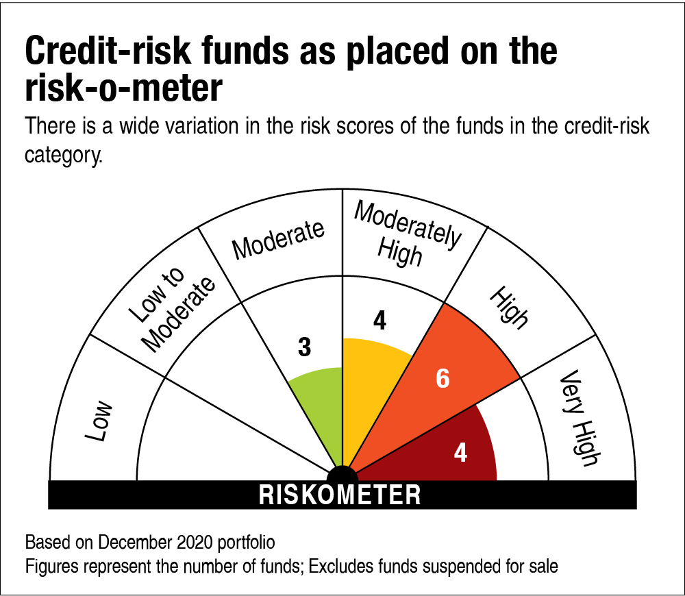
Let's take a look at one more category - the credit-risk funds (see the chart 'Credit-risk funds as placed on the risk-o-meter'). A category which is perceived to be riskiest also has shades of grey. The risk-o-meter brings out the fact that not all credit-risk funds are alike.
We placed the one-year returns and the lower-rated exposure of this category on the same graph (see 'Analysis of the credit-risk category') and again noticed that the funds that generated higher returns ranked higher on the risk-o-meter as well. Most of the funds tagged 'Very High' are the ones that either have high exposure to securities rated A and below or those that are unrated. Of course, the liquidity score also has a role to play here.
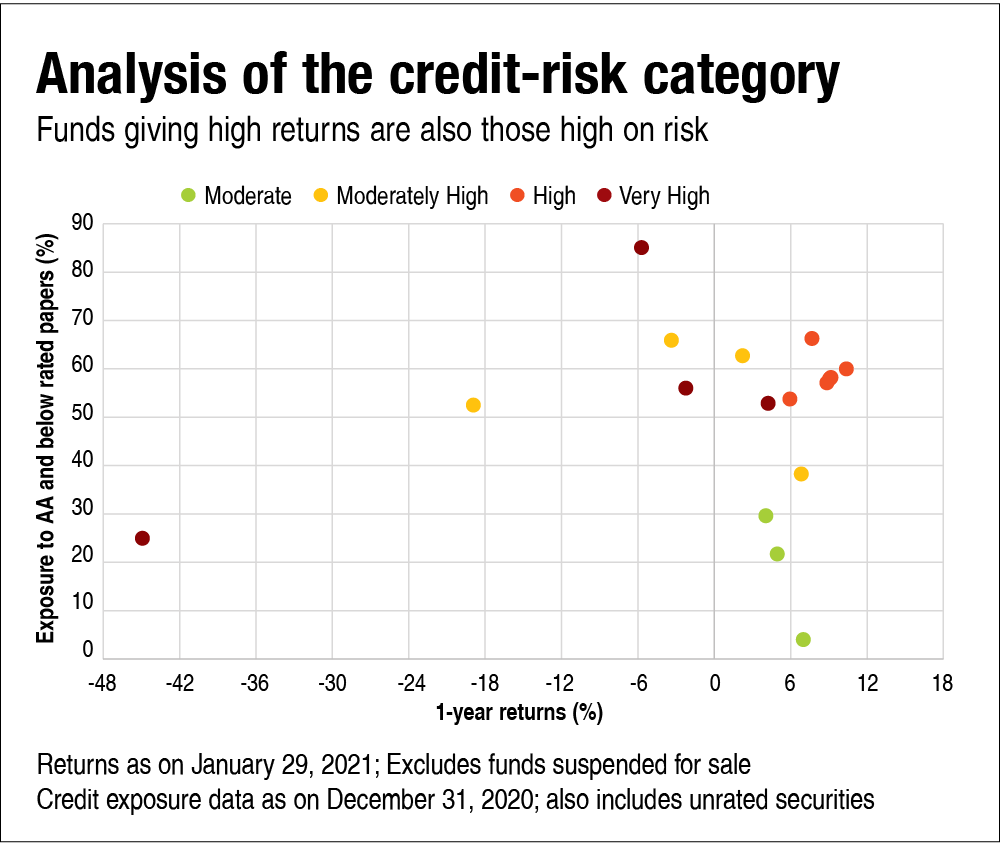
While the general trend shows that funds giving high returns are high on risk, there are quite a few funds which are giving negative one-year returns but are also ranked higher on risk. These are the ones where the defaults/downgrades have already materialised, given their riskier portfolio complexion translating into negative returns.
So, while the risk-o-meter in case of equity funds may not be of much help, it does seem pretty relevant in pointing out the risks in debt funds.
Ask Value Research ![]()